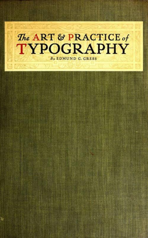
The Art and Practice of Typography - A Manual of American Printing
Nonfiction, Home & Garden, Crafts & Hobbies, Art Technique, Oil Painting, Art & Architecture, General Art| Author: | Edmund G. Gress | ISBN: | 9783736420038 |
| Publisher: | anboco | Publication: | June 17, 2017 |
| Imprint: | Language: | English |
| Author: | Edmund G. Gress |
| ISBN: | 9783736420038 |
| Publisher: | anboco |
| Publication: | June 17, 2017 |
| Imprint: | |
| Language: | English |
In the preface to the first edition of "The Art and Practice of Typography," the author stated that he did not "anticipate again having the pleasure of producing a book as elaborate as this one," but the favor with which the volume was received made another edition advisable, and in consequence he has had the additional pleasure of enlarging and revising it and of producing a volume even more elaborate and with a better selection of examples. The task of rewriting and replanning the second edition was near completion when America entered the war against Germany, and now, a few months later, the book is presented to the public. The first edition was published in February, 1910. Work on the new edition was begun by the author in the latter part of 1913, and so great has been the task, in addition to his customary editorial labors, that almost four years have passed. The extent of the work will be comprehended when it is mentioned that there are twenty-eight chapters, in which the illustrations or typographic arrangements, numbering six hundred and fifteen, include forty full-page specially-printed inserts. Most of these illustrations or typographic arrangements are in color. The text matter, which makes direct reference to the examples, totals nearly one hundred thousand words. That these examples are mostly high-class and by many of the best typographers in America (Europe also being represented), is due to the fact that the author during his connection with The American Printer has received several thousand pieces of printing, from which selections were made for this work. Great care was exercised in the choice of examples in order that the book would not become obsolete, and it is believed that most of the type arrangements shown will be considered good for a hundred years to come. That this is possible is proved by the Whittingham titles on page 32, one of which is sixty-eight and the other seventy-three years old at this writing.
In the preface to the first edition of "The Art and Practice of Typography," the author stated that he did not "anticipate again having the pleasure of producing a book as elaborate as this one," but the favor with which the volume was received made another edition advisable, and in consequence he has had the additional pleasure of enlarging and revising it and of producing a volume even more elaborate and with a better selection of examples. The task of rewriting and replanning the second edition was near completion when America entered the war against Germany, and now, a few months later, the book is presented to the public. The first edition was published in February, 1910. Work on the new edition was begun by the author in the latter part of 1913, and so great has been the task, in addition to his customary editorial labors, that almost four years have passed. The extent of the work will be comprehended when it is mentioned that there are twenty-eight chapters, in which the illustrations or typographic arrangements, numbering six hundred and fifteen, include forty full-page specially-printed inserts. Most of these illustrations or typographic arrangements are in color. The text matter, which makes direct reference to the examples, totals nearly one hundred thousand words. That these examples are mostly high-class and by many of the best typographers in America (Europe also being represented), is due to the fact that the author during his connection with The American Printer has received several thousand pieces of printing, from which selections were made for this work. Great care was exercised in the choice of examples in order that the book would not become obsolete, and it is believed that most of the type arrangements shown will be considered good for a hundred years to come. That this is possible is proved by the Whittingham titles on page 32, one of which is sixty-eight and the other seventy-three years old at this writing.
